Brand Guide
A visual reference for the "Estela Realty" template.
This page documents the core visual system used across the template: typography, colors, gradients, buttons, cards, components, breakpoints, and layout patterns.
For practical setup instructions, CMS editing, catalogue filters, forms, SEO, and publishing checks, please use the Template Instructions page.
Visual System Overview
"Estela Realty" combines large editorial typography, a warm neutral palette, soft gradients, and reusable CMS-ready components.
Typography is bold, spacious, and presentation-focused.
Colors are calm, neutral, and designed for a premium real estate feel.
Components are reused across cards, filters, buttons, navigation, and sections.
CMS content powers property listings, catalogue cards, and selected featured sections.
How to use this guide
Template Design System
A quick summary of the tone and structure behind this template. Specific brand voice and positioning are buyer-specific and marked below.
Editorial Typography
Large headings, compact supporting text, and strong spacing create a premium real estate presentation.
Warm neutral palette
Soft backgrounds, muted accents, and high-contrast text keep the visual system calm and refined.
Reusable Components
Cards, buttons, filters, navigation, and sections are built as reusable components for consistent customization.
CMS-READY LISTINGS
Property cards, catalogue sections, and featured listings are designed to work with CMS content where needed.
Type styles
The presets already used across the site, shown live so replacements stay consistent.
Heading 1 — 124px / 1.1
Heading 1
Heading 2 — 96px / 1.2
Heading 2
Heading 2-bold — 96px / 1.2
Heading 2-bold
Heading 3 — 47px / 1.2
Heading 3
Heading 4 — 32px / 1.2
Heading 4
Heading 5 — 124px / 1.1
Heading 5
title — 16px / 1.2
Title style sample
title italic — 16px / 1.2
Title italic style sample
BiG title — 20px / 1.2
BiG title style sample
paragraph — 16px / 1.2
Paragraph style sample used for descriptive prose.
paragraph-bold — 16px / 1.2
Paragraph-bold style sample.
subtitle — 14px / 1.2
Subtitle style sample
subtitle italic — 14px / 1.2
Subtitle italic style sample
property subtitle — (12px / 1.2).
Property subtitle italic style sample
button — 16px / 1.2
Button style sample
text link — 16px / 1.2
Text link style sample
Text links
The text link component in its available variants.
Default inline text link.
White link for use on dark backgrounds (desktop).
Black link for use on light backgrounds (desktop).
White link, mobile-tuned size, for dark backgrounds.
Black link, mobile-tuned size, for light backgrounds.
Palette
Only colors actually used across the site are listed here.
BG
Main page background surface.
Secondary
Muted accent, used for supporting text and highlights.
Tertiary
Cool secondary accent used in gradients and links.
black
Primary dark color for text and dark surfaces.
white
Primary light color for text on dark surfaces and light cards.
gradient Main
Primary gradient, black to secondary accent.
gradient Secondary
Light gradient, white to pale blue.
gradient Tertiary
Warm gradient, secondary accent to a lighter tan.
gradient Glass
Translucent blue gradient used for glass-style panels.
Reusable components
Live instances of every reusable component in this project, grouped by role: navigation, links & buttons, cards, and larger section blocks.
Navigation
Navigation_bar — main site header with logo, nav links, contact button, and social icons. Variant controls light/dark and burger-menu states.
Navigation_bar — main site header with logo, nav links, contact button, and social icons. Variant controls light/dark and burger-menu states.
Navigation_bar — main site header with logo, nav links, contact button, and social icons. Variant controls light/dark and burger-menu states.
Navigation_bar — main site header with logo, nav links, contact button, and social icons. Variant controls light/dark and burger-menu states.
Footer — site-wide footer with navigation columns, legal links, and social follow card.
Links & buttons
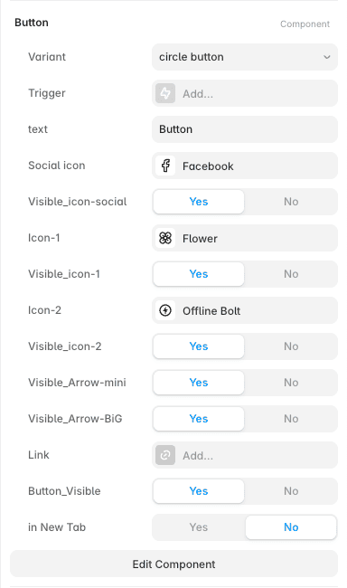
Button Customization
The Button component is designed to be highly flexible. You can create many different button styles by combining the exposed properties in the Style panel.
After selecting a Button component, you can customize:
Variant — choose the main button style, such as light, dark, mobile, social, arrow, circle button, or number.
text — update the button label.
Link — connect the button to a page, URL, section, or external destination.
in New Tab — choose whether the link should open in a new browser tab.
Button_Visible — show or hide the button when needed.
Social icon — select a social icon for social-style buttons.
Icon-1 and Icon-2 — choose additional icons from Framer’s native icon libraries.
Visible_icon-social, Visible_icon-1, Visible_icon-2 — show or hide specific icons.
Visible_Arrow-mini and Visible_Arrow-BiG — show or hide arrow accents depending on the button style.
By combining these properties, you can create CTA buttons, social buttons, icon buttons, arrow buttons, circular buttons, number badges, and small visual accents without rebuilding the component.
For example, you can use the same Button component as a simple contact button, a social media link, a circular icon button, or an arrow-based navigation button.
When customizing buttons, use the existing variants and visibility toggles first. Avoid detaching the Button component unless you need to change its internal layout or create a completely new button behavior.
Button_submit — dedicated form submit button with loading/success/error/disabled states.
filter_tag
filter_tag
filter_tag — selectable filter chip, active/non-active states.
text link — small inline navigational link component.
Cards
info_card
Compact card for a short point paired with icons.
info_card
Compact card for a short point paired with icons.
info_card
Compact card for a short point paired with icons.
Use a transition effect
to play the Rive animation with a glare.
info_card — used for feature callouts and summary points across the site.
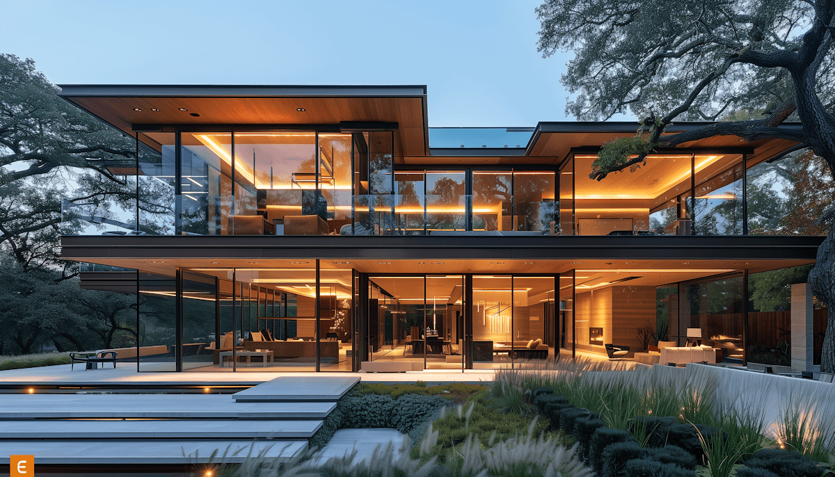
card-testimonial
They really listened to what I wanted and helped me find a place that feels so me. Everything was transparent and easy to understand - I couldn’t have asked for a better experience.”

Olivia Carter - Graphic Designer
card-testimonial — client quote with photo and name, used in testimonial sections.
Angle card
Bottom text, Bottom text, Bottom text, Bottom text, Bottom text, Bottom text, Bottom text, Bottom text, Bottom text, Bottom text, Bottom text, Bottom text, Bottom text, Bottom text
Angle card — large diagonal-style promo card with a CTA link.
process card
description
process card — numbered step card used in how-it-works style sections.
investor card
Job title
info

investor card — profile card with photo, name, and role, used on the investors page.
product-card — property/product listing card with specs and price, used in the catalogue.
FAQ_card
FAQ_card
Expandable question/answer row used in FAQ sections.
FAQ_card — expandable question and answer row, open/close states.
Tailored property search
roll_item — interactive list row with scroll-triggered reveal effects.

card_pic-info
Image-led card for feature grids.
card_pic-info — image card with a title and short description, used in feature grids.
Larger sections & system blocks
They really listened to what I wanted and helped me find a place that feels so me. Everything was transparent and easy to understand - I couldn’t have asked for a better experience.”
Olivia Carter - Graphic Designer
They really listened to what I wanted and helped me find a place that feels so me. Everything was transparent and easy to understand - I couldn’t have asked for a better experience.”
Olivia Carter - Graphic Designer
They really listened to what I wanted and helped me find a place that feels so me. Everything was transparent and easy to understand - I couldn’t have asked for a better experience.”
Olivia Carter - Graphic Designer
They really listened to what I wanted and helped me find a place that feels so me. Everything was transparent and easy to understand - I couldn’t have asked for a better experience.”
Olivia Carter - Graphic Designer
They really listened to what I wanted and helped me find a place that feels so me. Everything was transparent and easy to understand - I couldn’t have asked for a better experience.”
Olivia Carter - Graphic Designer
testimonial-slider — rotating slider of up to 5 client testimonial cards.
Our
top picks
this month
We carefully select each property to bring together quality, functionality, and timeless aesthetics - so you can simply move in and live beautifully. Every property is chosen with care — not just for its features, but for the feeling it gives the moment you walk inside.
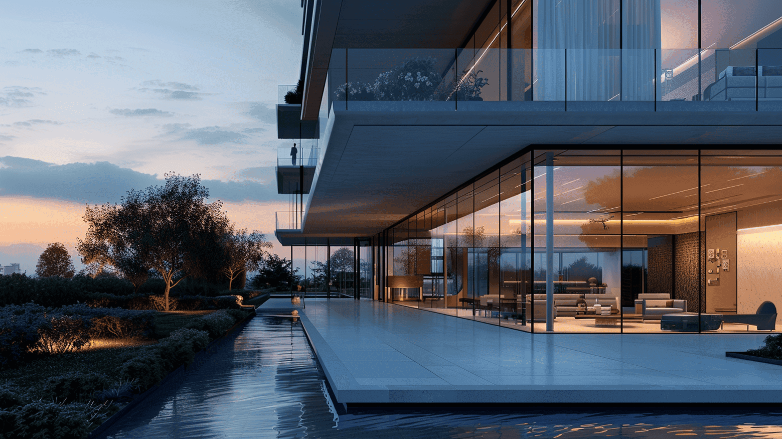
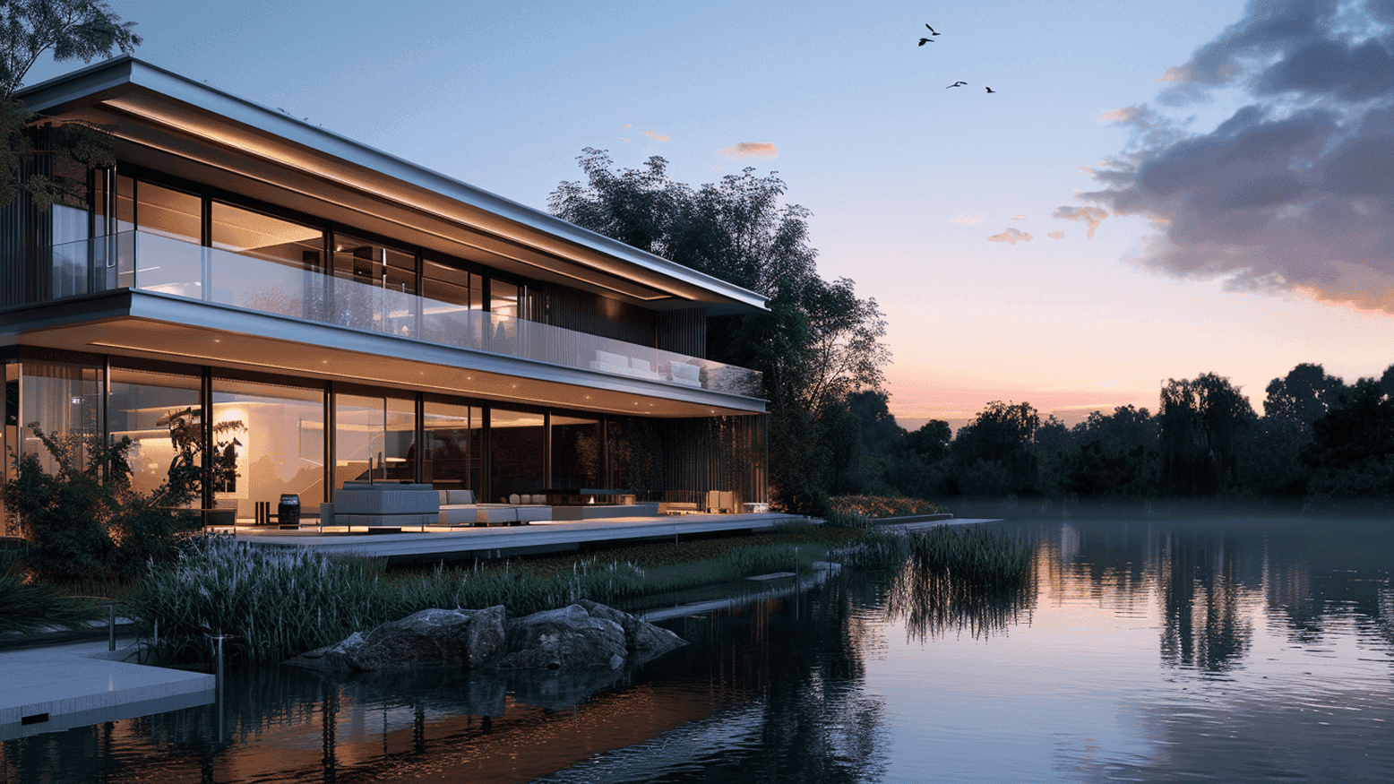
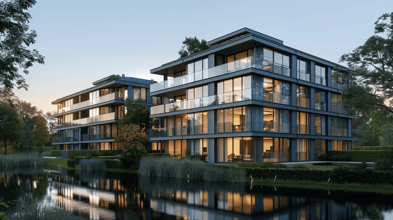
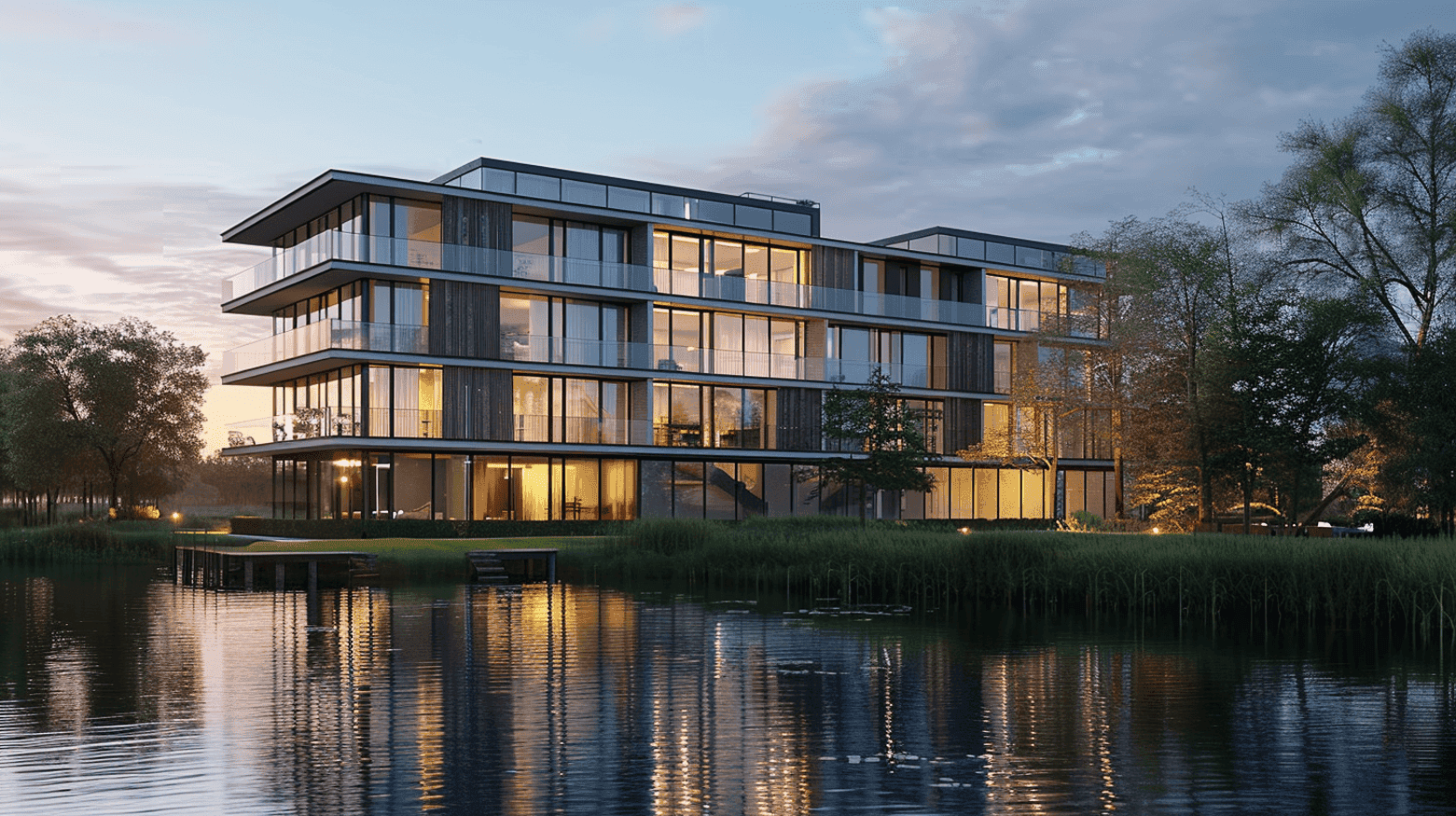
section_TOP-PICKS — a featured listings section for the Home page. Content is pulled from the Products CMS collection and selected through CMS filtering. See the Template Instructions page for details on editing Top Picks and using the Index Number field.
catalogue
Select a location
All
2 filter tab
3 filter tab
4 filter tab
5 filter tab
6 filter tab
Refine by Features
Lake view
Private terrace
City center
Sea view
Eco / sustainable
Fully Furnished
Parking / Garage
Fireplace
Swimming Pool
Terrace
Balcony
Garden
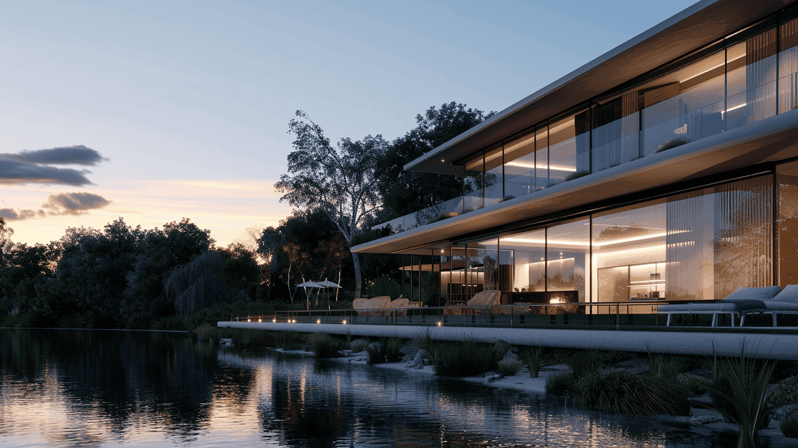
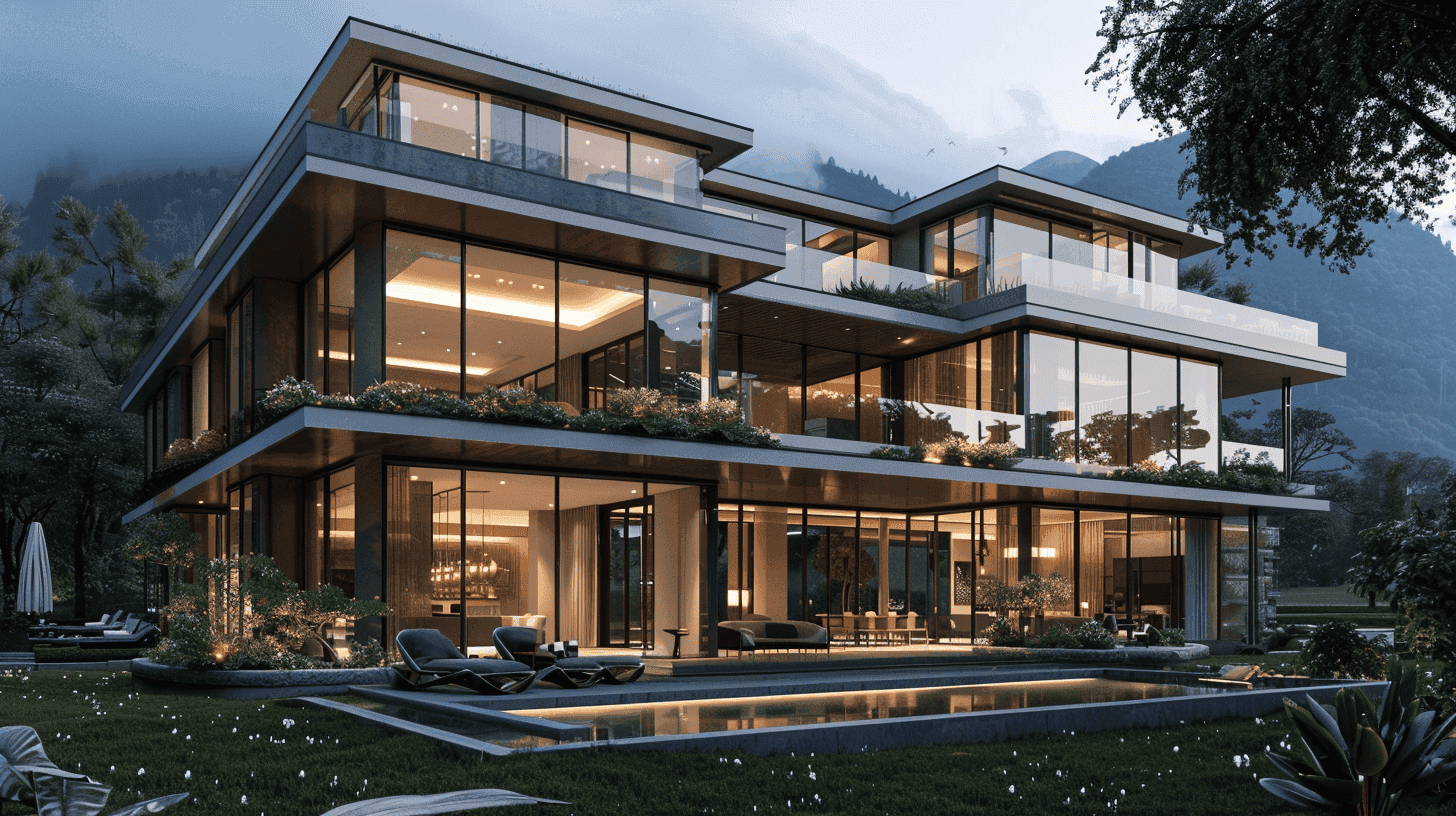
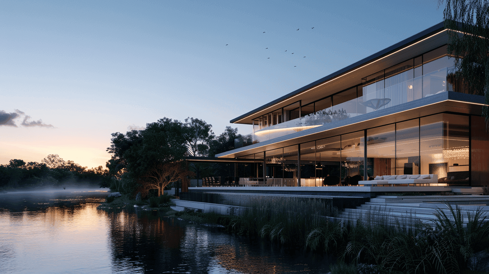
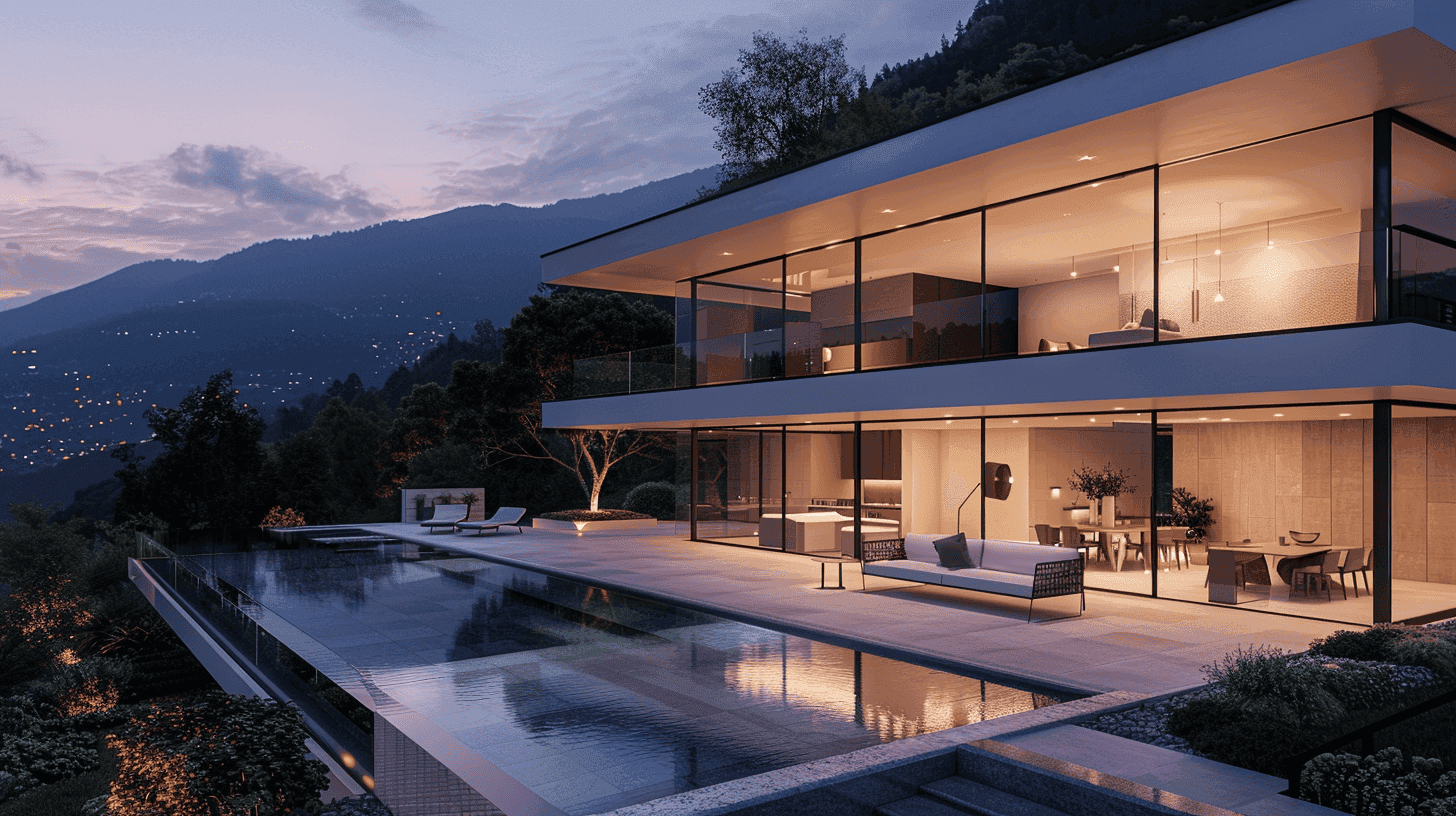
Catalogue — a CMS-powered listing section with location tabs, feature tag filters, and a responsive grid of product/property cards. See the Template Instructions page for details on editing filters, tabs, and CMS connections.
white gradient — decorative fade overlay with no exposed controls, used to soften transitions between sections.
Submit Form — the site’s contact/submission form block, paired with a Button_submit.
Spacing and Layout Notes
This template does not use a strict spacing scale. Most sections were built from repeated section and container patterns, then adjusted where needed for composition, animation, and visual balance.
When customizing the layout, use the existing sections as your main reference. If you need to add a new section, it is usually best to duplicate a similar existing section and adjust its content, spacing, and layout from there.
Some spacing values may vary between sections because of image composition, animated elements, responsive behavior, or specific design needs.
For best results:
keep section structure and containers consistent where possible
reuse existing section patterns before building new ones from scratch
adjust spacing visually when working with large images, animation, or overlapping elements
check Desktop, Tablet, Phone, and the Home page Big Width breakpoint after layout changes
avoid forcing a strict spacing system if it breaks the intended composition
The goal is to keep the visual rhythm of the template consistent, even when individual spacing values vary from section to section.
Breakpoints
Breakpoints used across the template:
Big Width — 1920px, used on the Home page for wider desktop layouts.
Desktop — 1440px, the main parent breakpoint for most pages.
Tablet — 768px.
Phone — 390px.
Desktop is the primary breakpoint. Smaller breakpoints inherit from it by default, while the Home page also includes the additional Big Width breakpoint for large screens.
Need Setup Help?
Use this Brand Guide as a visual reference for the template’s design system.
For step-by-step editing instructions, CMS setup, catalogue filters, forms, SEO, and publishing checks, open the Template Instructions page included in this project.