Internal Documentation
Template Instructions
Step-by-step guidance for customizing "Estella Realty" Framer template safely.
This template is built to make content editing and basic customization as simple and flexible as possible.
We’ve tried to provide a wide range of customization options while keeping the editing process clear and easy to follow.
The template is made of multiple customizable components. You can find the full component list in the left Framer panel under Assets → Project.

In most cases, you should edit content by selecting the relevant block directly on the canvas, then using the Style tab in the right Framer panel.

Components are highlighted with a purple outline when you hover over or select them. When a component is selected, open the Style tab and look for the section named after that component. There you’ll find the exposed properties available for editing, such as button text, links, images, element visibility, icons, and other customizable options.
Component usage is explained in more detail later in the dedicated section of this guide.

This guide explains how to update content, CMS property listings, catalogue filters, components, media, forms, responsive layouts, SEO, and publishing settings without breaking the template structure.
Quick Setup
CMS
Styles
Components
Publishing
1. Before You Start
Duplicate or remix the template into your own workspace.
Keep a backup before major edits.
Review the Brand Guide first.
Edit Desktop first, then check Tablet and Mobile.
The Desktop breakpoint is the parent version of the design. By default, all smaller breakpoints inherit its properties in descending order: Tablet, then Mobile.
This means that changes made on Desktop may affect the smaller breakpoints unless they are manually overridden.
Please also note that the Home page includes an additional Wide breakpoint. This Wide version also inherits its default properties from the Desktop breakpoint.
Use existing styles and component properties before making structural changes.
Use the CMS to manage property listing content, or any other type of product/content you adapt this template for.
This keeps repeated sections, catalogue cards, and related dynamic pages consistent across the template.
Avoid detaching or unlinking core components unless necessary.
Test catalogue filters, property detail pages, inquiry forms, and responsive layouts before publishing.
2. Quick Start
For the fastest and safest content updates, use Framer’s on-page editing mode on the published site.
After publishing the project, open the live website in your browser and click the Edit button. Editable elements will be highlighted directly on the page, allowing you to update most static content without opening the Framer canvas.
You can use on-page editing to:
update text and rich text
replace images
edit exposed component properties
update links, labels, and visible content where available
adjust content inside reusable components
reorder supported content blocks when available
This is the recommended way to make simple content updates without affecting the overall design system.
Please note:
CMS-driven property listings should still be reviewed carefully through the CMS structure, especially when updating property fields, catalogue data, filters, slugs, or dynamic detail pages.
Some advanced layout areas, layout templates, overlays, interactions, and structural design changes may still require editing inside the Framer canvas.
Replace the logo.
Update navigation links.
Update footer links.
Update homepage content.
Update your property or product listings through the CMS, using the Products collection.
All images and information directly related to individual listings/products should be managed through the CMS.
Check property cards and catalogue sections.
Configure filters and categories (tags collection).
Configure inquiry/contact forms.
Check responsive breakpoints.
Update SEO.
Publish.
3. Editing Page Content
The safest way to edit page content is through the Style panel.
Select the block or component you want to update on the canvas, then open the Style panel on the right side of the Framer interface. This is where most editable content and component properties are organized.
Depending on the selected element, you may be able to update text, links, images, visibility settings, icons, buttons, and other exposed properties.
You can also edit simple text directly on the canvas by double-clicking it. This is useful for quick copy changes, but the Style panel is usually more reliable and easier to control, especially when editing components.
Use the existing text styles instead of manually styling every layer. This helps keep typography consistent across the template.
If you want to change typography globally, update the text styles themselves rather than editing each text layer separately.
4. Working With Styles and Colors

The template uses shared styles to keep typography, links, colors, and gradients consistent across all pages.
You can find the full style system in the left Framer panel under Assets → Styles. This area includes Text styles, Link styles, and Color styles used throughout the project.
When customizing the template, we recommend updating shared styles whenever possible instead of manually changing individual layers. This keeps your edits cleaner and helps the whole site stay visually consistent.
Text styles are stored in the Text folder. Use them for headings, titles, paragraphs, subtitles, buttons, and text links.
Link styles are stored in the Link folder. They include the main link style, light/dark link variations, and mobile-specific link styles.
Color styles are stored in the Color folder. This includes the main gradients, background color, secondary and tertiary colors, black, and white.
When changing colors, update color styles rather than changing individual layer fills across the project. After editing colors, check contrast on property cards, catalogue filters, navigation, forms, and footer.
Keep gradients consistent with the existing visual language, and avoid adding many unrelated colors unless you are intentionally rebranding the template.
A more detailed visual breakdown of the full style system is available on the Brand Guide page included in this project.
BG
Secondary
Tertiary
black
white
gradient Glass
gradient Main
gradient Secondary
gradient Tertiary
Before a full rebrand, review the Brand Guide and check color contrast across key areas such as navigation, catalogue cards, filters, forms, and footer.
5. Replacing Images and Background Media
Most images in this template can be replaced through the Style panel.
Select the image itself, or the component that contains it, then open the Style panel on the right. If the image is available as a component property, replace it there without opening or detaching the component.
Regular image layers are usually marked with the img class in the Layers panel.
Hero background sections use layers named section_Image. Since these sections may have a gradient component placed above the image, select the section_Image layer from the Layers panel before replacing the background image.

Some background containers use the Container_Image class. These can usually be edited like regular images: select the container, then replace the image in the Style panel.

Framer usually fits images into the existing frame automatically, so exact proportions are not always required. For the best result, use images with a similar composition and crop direction to the original.
CMS-connected property or product images should be updated through the CMS, especially when they are used in catalogue cards, product cards, galleries, or dynamic detail pages.
You can also use Framer plugins to search for images or generate new visuals directly inside Framer.

Avoid deleting media layers inside components unless you understand how the component uses them. Replacing the image is usually the safer option.
Some sections in this template use background videos. These are most often CTA banners near the bottom of a page.
If you do not want to use video, you can remove the video layer and keep the fallback image instead.
When replacing a background video, we recommend replacing the fallback image as well. Ideally, use the first frame of the new video as the fallback image. This helps the section look consistent while the video is loading, or if the video does not load on slower connections.
This approach keeps the page lighter and gives users a clean visual fallback before the video starts playing.

The Home page includes a Top Picks section.
This section is built with the section_TOP-PICKS component and its media content is pulled from the CMS.
To update images in this section, edit the related product/property items in the Products CMS collection rather than replacing the images directly on the canvas.
We explain how to manage this section correctly later in Section 7, where we cover CMS catalogue filtering and featured product selection.
6. "Estella Realty" CMS Overview
This template uses two CMS collections:
Products — the main collection for property or product listings.
tags — a reusable collection for property features, amenities, or other filterable attributes.
You can open the CMS from the main Framer menu in the top-left corner of the interface. Click the CMS button to access and edit the project collections.
Inside the CMS, you can edit any field directly. For a more comfortable workflow, we recommend opening each product/listing as a full item card in the side panel and editing its content there.
Use the Products collection to manage the main listing content, including names, prices, descriptions, images, galleries, locations, property details, and other product-specific information.
Use the tags collection to manage reusable feature labels. In this template, tags are separated into their own collection to make the catalogue filtering cleaner and more flexible, especially when users need to select multiple features at once.
You can edit CMS field names and field types in the Fields tab on the left side of the CMS interface. Be careful when renaming or deleting fields, especially if they are already connected to catalogue cards, filters, detail pages, or components.
The CMS area also includes access to plugins. These can be useful for importing and exporting collections, managing larger content updates, or extending your CMS workflow.

Adding or Editing Property Listings
Use the Products CMS collection to add or update property listings.
For the fastest setup, you can duplicate an existing item. This keeps the field structure consistent and helps you avoid missing required content.
Recommended workflow:
Open the Products CMS collection.
Duplicate an existing listing or create a new item.
Update the Title.
Update the Slug carefully, especially if the item has already been published or linked.
Update the Price.
Update the Location.
Update Property Type and Condition / Style.
Update Bedrooms, Bathrooms, and Living Area.
Replace the Cover Image and Gallery images.
Update Short Info, Full Description, Interior & Design, Neighborhood, and Project Positioning Copy.
Update Property Features by selecting the relevant tags.
Preview the related CMS detail page before publishing.
If you want the listing to appear in the Top Picks section on the Home page, use the Index Number field. This workflow is explained in more detail in the Top Picks / Catalogue section below.
Warnings
Do not delete CMS fields that are connected to visible layers, catalogue cards, filters, or detail pages.
Do not rename slugs without checking existing links first.
Do not remove required images if cards or detail pages depend on them.
Do not manually edit repeated property cards if they are CMS-driven.
If a field affects filters, changing its value may change catalogue filtering.
Before changing CMS field names or field types, check where those fields are used across the template.
7. Catalogue and Filtering
The catalogue page uses two levels of filtering:
Main filtering by location, displayed as tabs.
Secondary filtering by tags, displayed as toggle-style feature filters.
The main location filtering is handled by the Catalogue component. This component includes six tabs.
The first tab shows the full unfiltered product list. Tabs 2–6 are designed for filtered catalogue views, with each variant filtering the list by a specific location or category.
By default, the last two tabs are turned off. You can enable them and edit their labels through the component properties in the Style panel.
The visible tab labels can be edited through the Catalogue component properties. This allows you to adjust the catalogue interface without opening or changing the internal structure of the component.
If needed, you can change the internal filtering logic inside the Catalogue component. This is possible, but it requires some Framer experience.
Before editing the internal structure of the Catalogue component, we recommend one of these safer approaches:
Duplicate the component and experiment with the copy.
Add new variants based on the closest existing tab variant.
For example, create a new second-tab variant from the existing second-tab variant, a new third-tab variant from the existing third-tab variant, and so on.
This helps preserve the existing tab behavior and reduces the chance of breaking other catalogue settings.
If you need help setting up custom filters, additional tabs, or a different catalogue structure, you can contact us for support and customization assistance.

Important:
Do not rename or delete CMS fields that are already connected to catalogue cards, product detail pages, filters, or components unless you understand where they are used.
For regular content updates, use the CMS and exposed component properties first. Edit the internal structure of Catalogue only when you need to change the filtering logic itself.
Top Picks Section
The Home page includes a featured section called Top Picks.
This section is built with the section_TOP-PICKS component and pulls its content from the CMS.
The section displays 4 selected product/property cards.
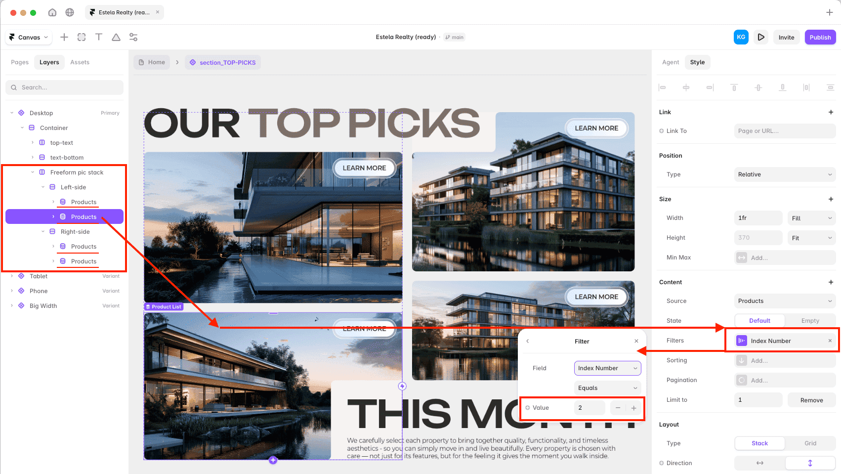
To choose which product appears in one of these slots, open the section_TOP-PICKS component and select one of the 4 CMS collection lists inside it. Then, in the Style panel on the right, find the filter settings and set the Index Number value to match the product you want to display.
Index Number is a field inside the Products CMS collection. You can use it to assign a simple order or selection number to each product.
For example, if a product has Index Number = 2, you can display it in a Top Picks slot by setting that slot’s CMS filter to:
Index Number → Equals → 2
or
To feature an item in Top Picks, set Index Number to one of the values already wired into that section — currently 2, 4, 5, and 7.
Using an index/order field like this is a common CMS workflow for featured sections, curated lists, custom ordering, and manually selected content blocks.

When changing Top Picks, make sure each selected product has a unique Index Number. If two products use the same number, the section may display an unexpected item.
8. Working With Components
This template is built with reusable Framer components. Components help keep the design consistent and make the template easier to customize.
When you select a component on the canvas, it will usually be highlighted with a purple outline. After selecting it, open the Style panel on the right side of the Framer interface.
Most components include exposed properties that allow you to edit their content without opening the component structure. Depending on the selected component, these properties may include text, links, images, icons, visibility toggles, variants, or other content settings.
Whenever possible, edit components through their exposed properties first. This is the safest way to update the template without breaking the layout or reusable structure.
Some components also include variants. Variants can control layout options, visual states, mobile versions, button styles, menu states, catalogue tabs, or other predefined design options.
Avoid detaching or unlinking core components unless you need to change their internal structure. For regular content updates, use component properties, variants, CMS fields, text styles, and color styles first.
If you need to make deeper changes to a component, we recommend duplicating it first and working with the copy. This gives you a safer space to test changes without affecting the original component.
9. Main Components Overview
Main Components Overview
The main reusable components are stored in the Assets panel under Project.
Navigation components:
Navigation_bar — global site navigation.
Footer — global site footer.
Buttons and links:
Button — main CTA and action button.
Button_submit — form submit button.
text link — inline or navigation text link.
filter_tag — toggle-style catalogue feature filter.
filter_drop-down-button — dropdown-style filter button.
Cards:
product-card — CMS-driven property/product card used in the catalogue and featured sections.
info_card — general information or feature card.
card-testimonial — testimonial card.
investor card — investment/ROI-related content card.
FAQ_card — FAQ accordion item.
card_pic-info — image and information card.
process card — step or process card.
Angle card — decorative or feature card.
roll_item — rolling/marquee item.
Larger sections and system blocks:
Catalogue — CMS-powered catalogue section with tab/filter variants.
section_TOP-PICKS — featured products/properties section on the Home page.
testimonial-slider — testimonial carousel.
white gradient — decorative gradient overlay.
Submit Form — documentation/showcase form component.
For most components, use the Style panel to update text, links, images, visibility, variants, and other exposed properties.
10. Navigation, Buttons, Cards, and Filters
Navigation, Buttons, Cards, and Filters
Navigation_bar and Footer are reused across the template. Edit them carefully, because changes may affect multiple pages.
Use Button for main actions and CTA links. Use Button_submit for form submission buttons. Use text link for lower-emphasis links, navigation links, or inline text links.
Use filter_tag and filter_drop-down-button for catalogue filtering interfaces. These components are connected to the catalogue filtering system, so test filters after changing labels, CMS fields, or property data.
The product-card component is CMS-driven. It displays content from the Products collection, such as title, price, location, bedrooms, bathrooms, living area, image, and other listing details. Do not manually edit repeated product cards on the canvas if they are connected to CMS. Update the related item in the Products collection instead.
Other cards, such as info_card, card-testimonial, investor card, FAQ_card, process card, and card_pic-info, are used for static content sections. In most cases, you can update their text, images, icons, and visibility through component properties in the Style panel.
Keep card spacing, image proportions, border radius, and metadata alignment consistent across the template. After editing cards or filters, check the layout on Desktop, Tablet, and Mobile.
Important:
Do not detach, unlink, or edit the internal structure of core components unless you need to change how the component works.
For normal content updates, use:
CMS fields
component properties
component variants
text styles
color styles
If you need to customize component logic, filtering, states, or internal layout, duplicate the component first or contact us for support.
Buttons, Icons, and Nested Properties
Many components in this template are built with nested reusable elements. For example, some cards include buttons inside them, and those buttons may also have their own exposed properties.
This means you can often customize a card without opening its internal structure. Select the card or button on the canvas, then use the Style panel to adjust the available properties.
The Button component is highly customizable. Depending on the selected variant, you can change the button style, label, link, visibility, icon settings, arrow options, social icon options, and whether the link opens in a new tab.
Some button variants are designed for regular CTA buttons, while others are used for social links, arrow buttons, circular buttons, numbers, or compact mobile versions.
You can also choose icons from Framer’s native icon plugins when an icon property is available. This makes it easy to adapt buttons and cards to your own project without rebuilding the component.
When a button is placed inside another component, such as a card, always check the exposed properties first. In most cases, you can update the nested button directly through the parent component or through the selected button’s Style panel.
Avoid detaching cards or buttons just to change labels, links, icons, or button variants. Use exposed properties and variants first. Detach or edit the internal structure only if you need a custom layout or behavior that is not available through the existing properties.
11. Forms and Property Inquiries
The main inquiry form is located on the Contact page.
This is the live form buyers should edit and test before publishing. It includes fields such as name, email, property name, phone number, inquiry topic, and message.
To customize the form, open the Contact page and edit the form fields directly there. You can update field labels, placeholder text, dropdown options, and button text as needed.
The topic dropdown can be used to organize different types of requests, such as property availability, pricing and payment questions, investment opportunities, viewing appointments, property details, legal questions, relocation inquiries, partnerships, or general questions.
Please note that the Property Name field is filled in manually by the visitor. It is not automatically connected to a specific property listing or CMS item by default.
There is currently no dedicated inquiry form inside the property detail pages. Property inquiries are handled through the general Contact page.
Before publishing, make sure to:
check all form fields
check required fields
test success and error states
verify the form submission destination
submit a test inquiry
check the form on Desktop, Tablet, and Mobile
The Submit Form component shown in the Brand Guide is only a showcase/example component. It is not the live form buyers should edit. Use the actual form on the Contact page for real inquiries.
12. Responsive Editing
Start editing from the Desktop breakpoint. In this template, Desktop is the parent breakpoint, and smaller breakpoints inherit its default properties.
After making major changes on Desktop, always check Tablet and Mobile.
The Home page also includes an additional Wide breakpoint. This breakpoint inherits from Desktop as well, so review it after changing large layout sections.
Avoid fixed widths when possible. They can break flexible layouts on smaller screens. Try to keep stacks, grids, and responsive containers intact.
After editing content, images, cards, catalogue sections, filters, forms, navigation, or footer, check how everything looks on Tablet and Mobile.
Pay special attention to:
mobile navigation
catalogue cards
filters and dropdowns
property cards
image galleries
forms
large gradient sections
footer layout
This template also includes mobile-specific link styles:
Text-Link_White(mobile)
Text-Link_Black(mobile)
Do not assume that changes on one breakpoint will look correct everywhere. Always preview the page across all breakpoints before publishing.
13. SEO Before Publishing
Before publishing, review the SEO settings for all main pages and CMS property pages.
Update page titles, descriptions, Open Graph images, social previews, favicon, and alt text for important images.
For CMS property pages, make sure each listing uses a clean slug and that the title and social preview image are connected correctly.
If you want custom meta descriptions for each property, add or connect the needed CMS SEO fields before publishing.
Do not duplicate CMS property detail pages manually. Edit the CMS item instead.
Also replace any default “My Framer Site” text with your actual brand or project name before publishing.
If you need advanced SEO setup, deeper optimization, or a custom SEO strategy, our in-house SEO specialist can help you configure the project properly.
14. Publishing Checklist
Check all pages.
Check CMS property/product listings.
Check property detail pages.
Check catalogue filters.
Check Top Picks / featured listings.
Check forms and inquiry flow.
Check navigation and footer links.
Check social links.
Check responsive breakpoints.
Check image quality and compression.
Check SEO titles and descriptions.
Check Open Graph images.
Check favicon.
Check custom domain.
Submit a test form.
Preview the site before publishing.
Publish.
15. Performance Notes
To keep the site fast and smooth, pay attention to media size and interactive elements.
Compress large property images before uploading them.
Avoid oversized gallery images.
Avoid unnecessary large videos.
Use fallback images for background videos.
Test Rive animations and interactive sections after editing.
Avoid adding too many third-party scripts.
Keep repeated catalogue cards and CMS sections optimized.
Check page speed after replacing media or adding new content.
For most updates, replacing optimized assets with similarly sized files will keep the template performing well.
16. What Not To Change Casually
Some parts of the template are connected to CMS, components, filters, or global styles. Edit them carefully.
Be careful with:
CMS collection names and field names
These may be connected to catalogue cards, filters, and detail pages.
Product/property slugs
Slugs are used in URLs. Changing them may break existing links.
Property detail page structure
One CMS detail page controls the layout for all property/product pages.
Property detail page structure
This single layout renders every property — a broken layout breaks all listings at once.
Catalogue filter logic
Filters are connected to CMS fields and component variants.
product-card and Catalogue components
These are CMS-driven and used across repeated sections.
Navigation and Footer
These are reused across the site, so changes can affect multiple pages.
Global text and color styles
Updating them changes typography and colors across the whole template.
Form destinations
Always check where form submissions are sent before publishing.
Mobile menu structure
Changes can affect mobile navigation.
Rive animations and custom code, if present
Edit these only if you understand how they are used.
For regular edits, use CMS fields, component properties, variants, text styles, and color styles first.
17. Advanced Customization Notes
Advanced Customization Notes
Most common content updates can be done through CMS, component properties, text styles, and color styles.
If you plan to deeply customize the template, we recommend reviewing these areas first:
CMS fields and collection structure
Catalogue filtering logic
Top Picks / featured listing setup
Property detail page layout
Form submission settings
Component variants and exposed properties
Responsive behavior on all breakpoints
Asset licenses
SEO settings
Custom code or Rive interactions, if used
For advanced customization, it is a good idea to duplicate important components or create a backup before making structural changes.
If you need help with deeper customization, filtering logic, SEO, animations, or CMS setup, you can contact us for support.
18. Final Buyer Checklist
Replace the logo
Update navigation
Update footer
Update brand colors if needed
Update typography if needed
Replace page copy
Replace images and background media
Update CMS property/product listings
Update featured / Top Picks listings
Update property categories, locations, or filters if needed
Update agents or contact information if present
Configure forms
Test form submissions
Test catalogue filters
Test property detail pages
Check Desktop, Tablet, Mobile, and Wide breakpoint where available
Check SEO settings
Check social preview images
Check custom domain settings
Preview the site
Publish
Enjoy:)
This guide can stay in the project as a reference while you continue customizing the template.